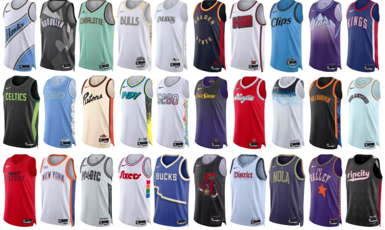
The NBA just released their 2024-25 city connect jerseys. There are some good and some bad. Here are the top ten best jerseys of the season. Their rankings come from a combination of color, design, and creativity.
- Brooklyn Nets
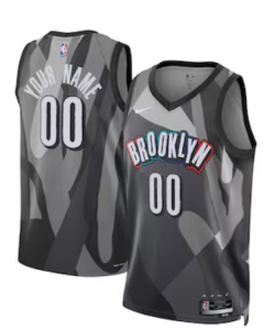
Color : 8/10, I really like the colors on the Brooklyn logo as well the gray and black in the background. It really makes it pop.
Design: 6.5/10, I am a big fan of the font of the brooklyn logo, it’s kinda the same font from last year’s jersey but I really like it.
Creativity:6/10, This is somewhat like last years with the gray and black with the funky font but just minimized this time.
Overall 7/10, I mean this jersey is pretty good but it still reminds me of last year’s jersey though…
- Portland Blazers
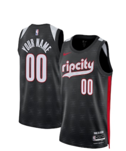
Color: 8/10, I mean you can never go wrong with red and black but they have been using these colors for a while now.
Design: 8/10: This jersey looks pretty cool with the big “Rip city” written across the front on top of the fading pattern.
Creativeness:3/10, this jersey is literally the same jersey from last but just two colors swapped.
Overall: 7.5/10, This jersey would definitely have been higher if it weren’t almost the exact same thing from last year’s city jersey. Still, it is a cool jersey.
- Cleveland Cavaliers
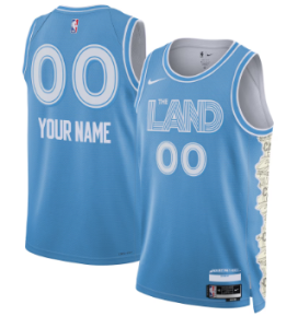
Color: 10/10, I absolutely LOVE this color. Especially with the white accents on it, the jersey has no loose ends.
Design: 7/10, The design looks cool but I’m not a fan of the lines on the font
Creativeness: 9/10, completely different from last year with the font and color.
Overall: 8/10, I really like the color, it’s just the font, in my opinion, that doesn’t fit.
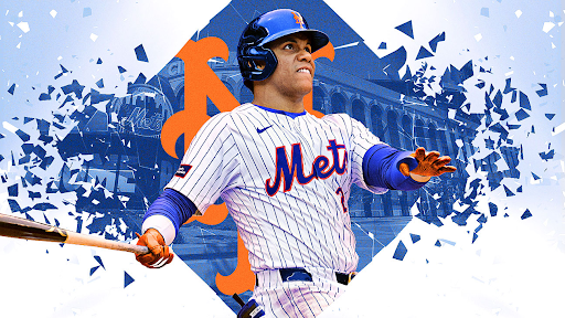
- New York Knicks
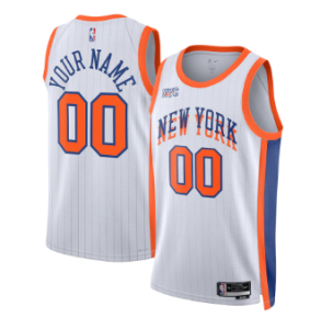
Color: 8/10, now don’t get me wrong the Knicks colors are good but I wanted something special. Like what Cleveland did.
Design: 9/10, I really like that they added pinstripes. I think adding pinstripes to a jersey is possibly the best thing a jersey could have. However, I don’t like the New York logo splitting. I think it’s too much for the front.
Creativeness: 8/10, I think this is almost last year’s jersey, just white and pinstripes were added but it’s good either way.
Overall: 8/10, I like that they added pinstripes but besides that, that’s pretty much it to be honest.
- Philadelphia Sixers
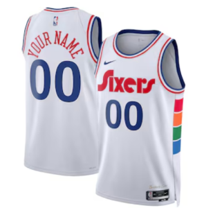
Color: 7/10, Love the colors especially the red, blue, green, and yellow on the side. But I think they look a little bland because there is too much white.
Design: 8.5/10, I like the font that the “Sixers” is in. I think it gives it a retro vibe.
Creativeness: 10/10, The jersey is completely different from last year and has plenty of creative elements.
Overall: 8.5/10, I like the design but the colors aren’t that great.
- Phoenix Suns
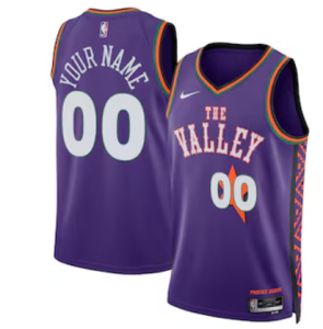
Color: 9/10, I love the green, orange and purple look. It’s kind of a mid west vibe.
Design: 9/10, I really like “The Valley” on the front with the star as well. It also has a cool pattern on the side.
Creativeness: 8/10, I really like the pattern on the side but they already used “The Valley” last year and still had the same color pattern.
Overall: 8.5/10, I do like this jersey a lot with the star and everything but I felt like they should have changed the color pattern from last year.
- Memphis Grizzlies
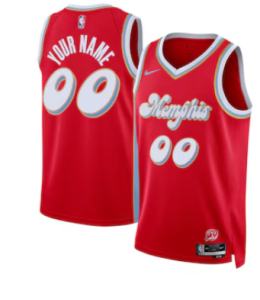
Color: 10/10, I think this jersey definitely has the best color scheme out of all the city jerseys. I mean the red, blue, and gold just go so well together.
Design: 8/10, It’s a little bland by just changing the font but it still looks really cool
Creativeness: 9/10, This jersey was definitely a step up from last year with a unique color scheme and design.
Overall: 9/10, I like the red, blue, and gold scheme with the new font. I think this jersey is really dope overall.
- Orlando Magic
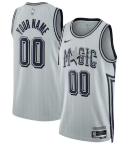
Color: 9/10, I love the gray and dark blue color scheme. I think it really ties the jersey together.
Design: 10/10, I love the pinstripes and with the star in magic is really cool.
Creativeness: 10/10, I love that they added pinstripes and with the flip of colors from last year.
Overall: 9/10, I love the pinstripes and the design overall, however I think the color scheme could have been a little better, but it’s still good.
- Utah Jazz
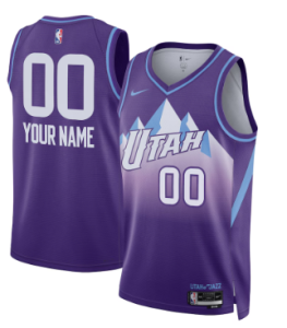
Color: 10/10, I love that they finally bring back the retro colors for once. And these colors just tie the jersey so well. Like the white on the mountains, the blue on the collar and the purple all over is beautiful.
Design:10/10, The retro mountains are absolutely beautiful and are excellent for this jersey.
Creativeness:9/10, Now they did kinda copy last years but they somehow out did themselves with the same design.
Overall: 10/10 Beautiful colors and design with retro on this jersey is perfect.
- Toronto Raptors
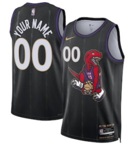
Color: 10/10, The gold, black, purple and red are beautiful. They all tie together as well.
Design: 11/10, Man with the pinstripes, retro dinosaur and a vince carter reference!? This has to be one of the best jersey designs of all time.
Creativeness: 10/10, With all of these references and the BIG step up from last year this jersey is awesome.
Overall: 10.5/10, This jersey color, design, and creativeness is unbelievable compared to other jerseys. Some other teams need to take notes of how the raptors did this city jersey.


