- Community
- Editorials
- Opinion
- Reviews
- Seahawks Student Updates
- SLHS Updates
- Top Stories
- Winter Season Articles
We tried Schoology. Students and teachers want Google Classroom back.
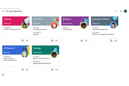
Image via The Wire Cutter
Students and teachers have had to deal with many unprecedented changes since returning to school this year. One of the major differences of the 2021-22 school year is the transition from Google Classroom to Schoology. FCPS decided to make the switch after parents expressed concern about not being able to see their child’s work and progress, especially after virtual learning where many students struggled to adjust. However, there has been a general sense of unhappiness expressed as the school tries to make do with Schoology. So why is Google Classroom better?

Google Classroom made it easy to see when assignments had been posted, and most importantly, allowed them to be removed from students’ to-do lists once completed. One of the most confusing aspects of Schoology is that even if an assignment has been completed, it still stays under the “Upcoming” tab. This makes it easy for assignments to get lost in the constantly updated stream, and adds an unnecessary layer of confusion when students attempt to remember if they’ve completed an assignment.
The Google Classroom to-do list was also formatted in a more conducive style. At the top of the “Classes” page in Classroom was a small button labeled “To-Do” with four sections. Assignments would fall under a category depending on when they were due, for example, “This week” or “Next week.” The default setting would include all assignments, but there was the option to filter assignments by class. There were also tabs labeled “Missing” and “Done” which categorized assignments whose due date had passed or assignments that had been turned in. This allowed students to prioritize assignments as they were easily able to sort through what they needed to complete.

Next to the “To-Do” button was a “Calendar” button. This allowed students to see the assignments on their calendar, and as assignments were posed on the site they would automatically be added. This provided students another way to decide which assignments needed to be prioritized based on their due date.
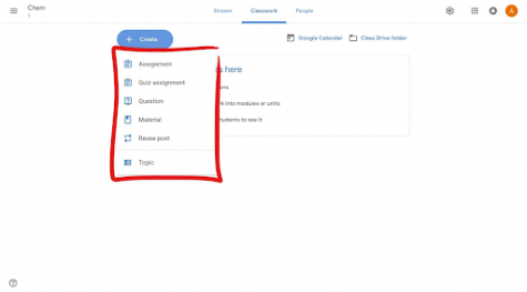
Another convenience of Google Classroom was the ease with which teachers could post assignments.
“I just liked how easy it was to embed everything in Google Classroom. Everything flowed really well together,” remarks Spanish teacher Mrs. Hope. “In Google Classroom, I could make an assignment with a Google document and then just copy it to all my classes. In Schoology, it looks like I can copy it to all my classes, but it doesn’t copy the actual Google document. So then I have to go into my other classes [with a] shell assignment and add a document into each [assignment].”
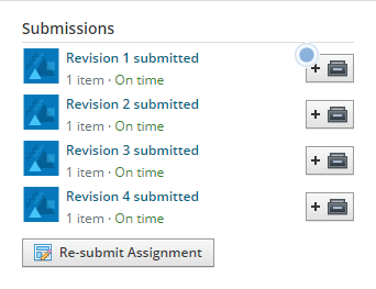
In addition, Schoology has many small issues that make it irritating to use. Students can’t unsubmit assignments after they’ve turned them in, instead, teachers have to unsubmit it for them. This makes it difficult when students have a spelling or grammatical error, or when they’ve turned in an assignment before the due date but then receive new information and want to edit their assignment. Students can resubmit assignments, but the process is slow and creates several unnecessary steps.
In Google Classroom, when students had comments to make under an assignment, the option would appear below a student’s submission. In Schoology, there is no way to comment without it being public. This can make it awkward for students to ask questions about assignments, as when comments are posted everyone who has been assigned that particular assignment will receive a notification on Schoology.

A small but annoying aspect of Schoology is that when links are posted in a class, users have to click the expand button to get to the website linked. Sometimes, links won’t even work unless the expand button is clicked. The process would be much easier if links simply took the user to the website without the unnecessary middle step.
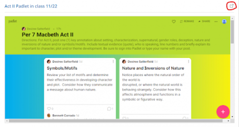
Perhaps the most frustrating part of the switch is that FCPS already uses so much of the Google interface. Students are given a school Google email in fourth grade, and they’re expected to save their documents to their Google Drive. Students write papers on Google Docs and create presentations with Google Slides. Google Classroom was designed to work with these, and made the process of assigning and submitting schoolwork more intuitive. Schoology can work with Google Apps, but the process is clumsy and often unclear.
“The layout of Schoology is a lot worse than Google Classroom,” sophomore Sophia Paradowski confirms. “Assignments don’t disappear on the upcoming list, the home page is a list of announcements that don’t really have any significance to me and are useless, the folder system is confusing, and the overall style of it isn’t very nice to look at.”
There’s no easy fix to this problem, as FCPS will likely be sticking with Schoology for the next few years and Schoology probably won’t be doing a complete overhaul on their site. However, it’s possible that FCPS could switch to a joint system, like when schools used both Blackboard and Google Classroom. More likely, over time Schoology will continue to make small adjustments to make their site more user friendly. For the time being though, students and teachers will have to leave their longing for Google Classroom behind and make the best of the situation with Schoology.

Emmalina is currently a Senior at South Lakes High School and Co-Editor in Chief of the Sentinel. This is her 3rd year writing for the newspaper, and she...








Suresh • Sep 15, 2022 at 3:40 am
I agree . I am a high school teacher in New Zealand. I ran google classroom and schoology for my classes over the long lockdown periods. I got students to vote for their preference. Out of 110 students 100 voted for GC, 1 voted for Schoology and 9 did not vote.